In this post, I will go through the AUC ROC curve and explain how it evaluates your model’s performance. Highly suggest you go through the Confusion Matrix post before you go ahead.
All set? Let’s explore it! :D
AUC ROC is one of the most important evaluation metrics for any classification model’s performance.
What is ROC?
ROC (Receiver Operating Characteristic) Curve tells us about how good the model can distinguish between two things (e.g If a patient has a disease or no). Better models can accurately distinguish between the two. Whereas, a poor model will have difficulties in distinguishing between the two.
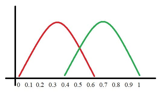
Let’s assume we have a model which predicts whether the patient has a particular disease or no. The model predicts probabilities for each patient (in python we use the“ predict_proba” function). Using these probabilities, we plot the distribution as shown below:
Here, the red distribution represents all the patients who do not have the disease and the green distribution represents all the patients who have the disease.
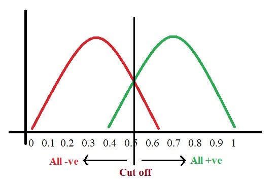
Now we got to pick a value where we need to set the cut off i.e. a threshold value, above which we will predict everyone as positive (they have the disease) and below which will predict as negative (they do not have the disease). We will set the threshold at “0.5” as shown below:
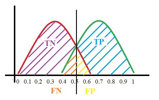
All the positive values above the threshold will be “True Positives” and the negative values above the threshold will be “False Positives” as they are predicted incorrectly as positives.
All the negative values below the threshold will be “True Negatives” and the positive values below the threshold will be “False Negative” as they are predicted incorrectly as negatives.
Here, we have got a basic idea of the model predicting correct and incorrect values with respect to the threshold set. Before we move on, let’s go through two important terms: Sensitivity and Specificity.
What is Sensitivity and Specificity?
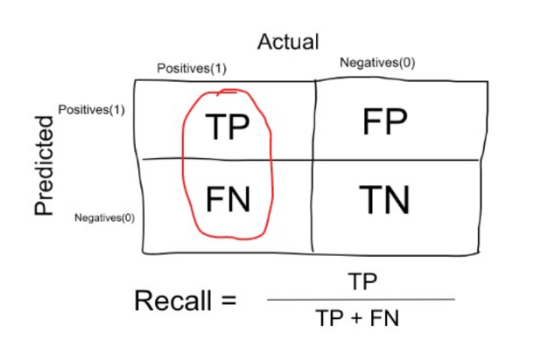
In simple terms, the proportion of patients that were identified correctly to have the disease (i.e. True Positive) upon the total number of patients who actually have the disease is called as Sensitivity or Recall.
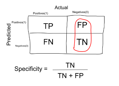
Similarly, the proportion of patients that were identified correctly to not have the disease (i.e. True Negative) upon the total number of patients who do not have the disease is called as Specificity.
Trade-off between Sensitivity and Specificity
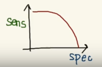
When we decrease the threshold, we get more positive values thus increasing the sensitivity. Meanwhile, this will decrease the specificity.
Similarly, when we increase the threshold, we get more negative values thus increasing the specificity and decreasing sensitivity.
As Sensitivity ⬇️ Specificity ⬆️
As Specificity ⬇️ Sensitivity ⬆️
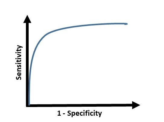
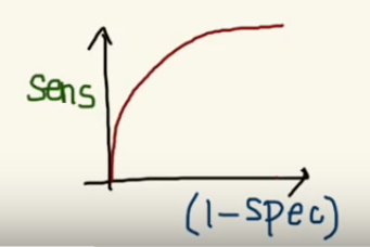
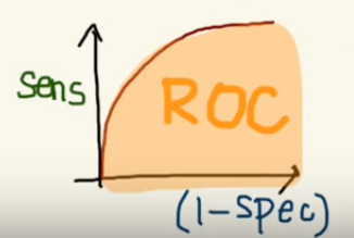
But, this is not how we graph the ROC curve. To plot ROC curve, instead of Specificity we use (1 — Specificity) and the graph will look something like this:
So now, when the sensitivity increases, (1 — specificity) will also increase. This curve is known as the ROC curve.
I know you might be wondering why do we use (1 — specificity)? Don’t worry I’ll come back to it soon. :)
Area Under the Curve
The AUC is the area under the ROC curve. This score gives us a good idea of how well the model performances.
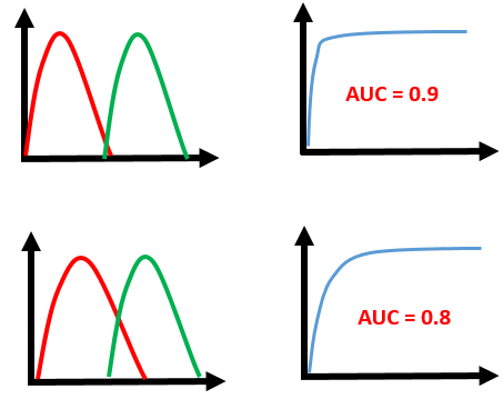
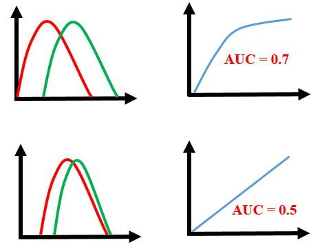
Let’s take a few examples
As we see, the first model does quite a good job of distinguishing the positive and the negative values. Therefore, there the AUC score is 0.9 as the area under the ROC curve is large.
Whereas, if we see the last model, predictions are completely overlapping each other and we get the AUC score of 0.5. This means that the model is performing poorly and it is predictions are almost random.
Why do we use (1 — Specificity)?
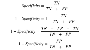
Let’s derive what exactly is (1 — Specificity):
As we see above, Specificity gives us the True Negative Rate and (1 — Specificity) gives us the False Positive Rate.
So the sensitivity can be called as the “True Positive Rate” and (1 — Specificity) can be called as the “False Positive Rate”.
So now we are just looking at the positives. As we increase the threshold, we decrease the TPR as well as the FPRand when we decrease the threshold, we are increasing the TPR and FPR.
Thus, AUC ROC indicates how well the probabilities from the positive classes are separated from the negative classes.
I hope I’ve given you some understanding on what exactly is the AUC ROC curve and how it evaluates your model’s performance
